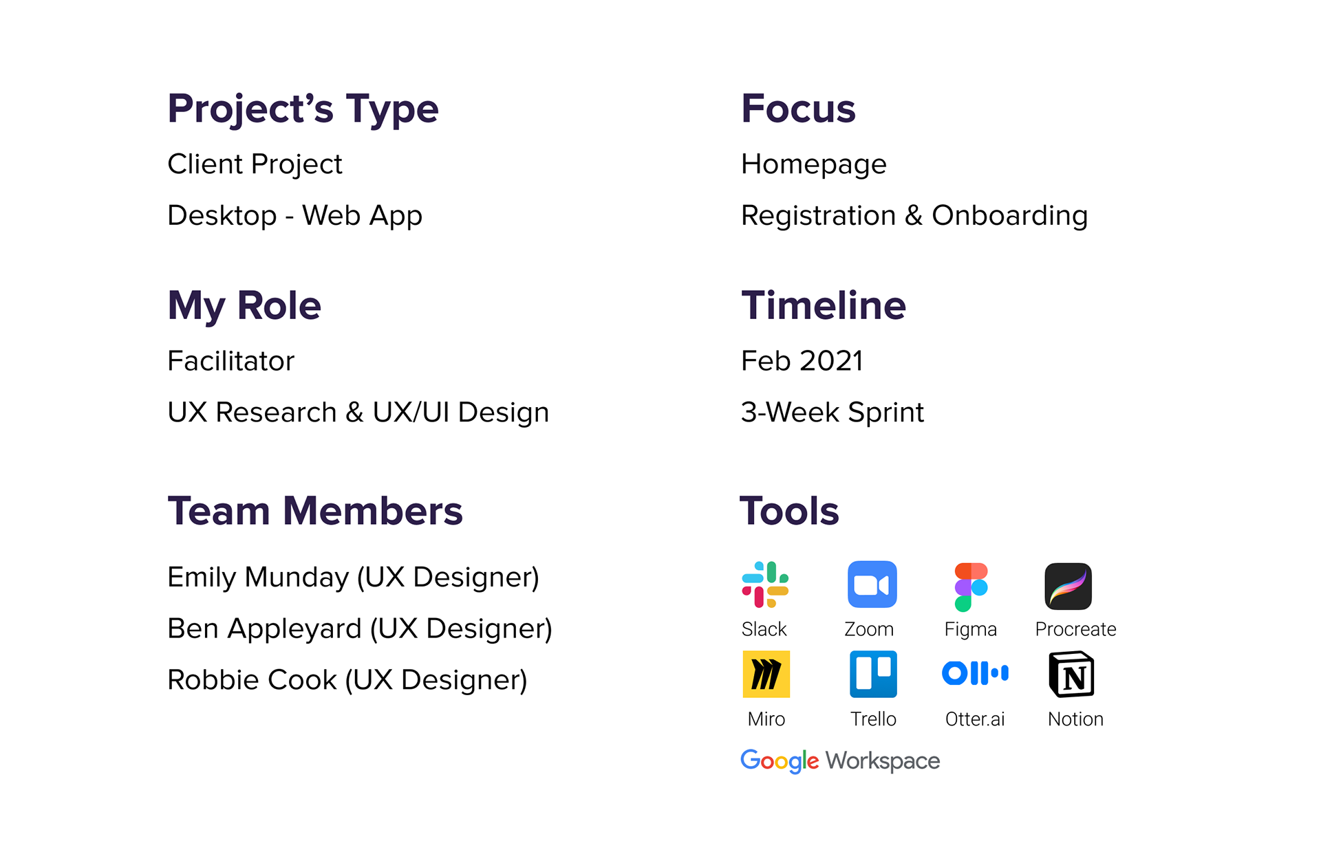
OVERVIEW
Axis Workshops LTD is a London-based Software Company. Their product is a web-based application that makes it simple and easy to facilitate meetings. Originally it was designed for in-room activities, but due to the massive changes caused by the pandemic, they have seen an opportunity to ensure that it works efficiently remotely as well.
The Problem
The current registration process' drop off rate fluctuates between 55-65%. More than half of the registrants get lost in the process and they don't manage to login on the homepage. Also, the phases (structure) of the app doesn't make sense to the users and confuses them.

The Solution
We optimised the registration process flow by redesigning the homepage, onboarding, and the actual app itself, based on research and users' feedback. Some steps have been simplified or removed; others were transferred to a later stage of the onboarding or merged with other screens. Restructuring the web app was the biggest challenge, as we had to analyse and understand each stage of the process (setting up a workshop) to ensure the facilitators’ seamless experience.
Our approach to solve the problem
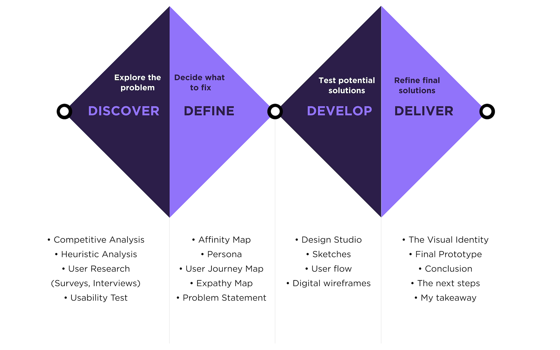
We applied the Double Diamond process, a framework that segments the design process into four stages: discover, define, develop and deliver.
My Contribution
I started the project by demonstrating the importance of following a user-centred design process to the stakeholders and facilitated a kick-off session to set goals and expectations for. I advocated for conducting user interviews, synthesis and brainstorming sessions before arriving at solutions. I led research and design activities, created wireframes, high-fidelity designs, and prototypes for user feedback and testing. During our final presentation to the client, I impersonated our persona (Claire) meanwhile talked through the final interactive prototype.
Design Outcome
Our final design solution allows the users swiftly and securely get through the registration, then learn how to use the product via a quick tour and finally easily access workshop templates to save time.

RESEARCH
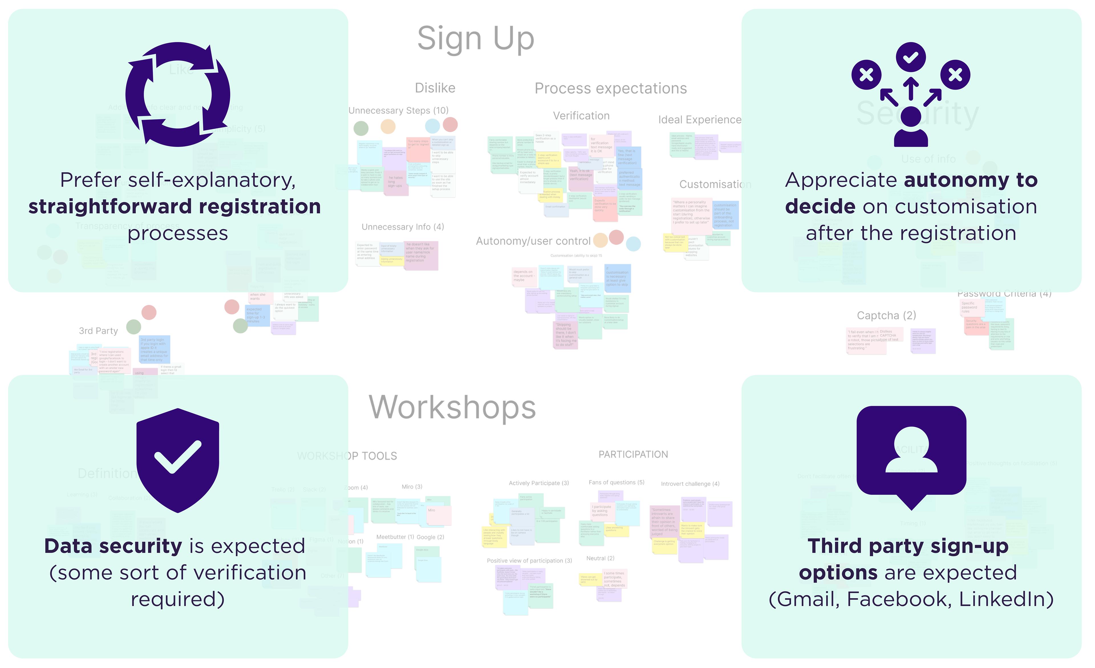
The discovery phase included competitive analysis and a rigorous review of the existing home page and registration process (heuristic evaluation). Of course, we have also involved the users in defining the problem by conducting usability tests on the existing platform. We have discovered that users find the homepage’s navigation somewhat confusing, the current registration process too lengthy. Due to the app’s complexity users would expect an onboarding.
During the define phase we received 134 responses to our survey and we interviewed 9 respondents to comprehend better our user's needs. The insights allowed us create our persona who helped us to keep the user in mind throughout the whole design process.
During the define phase we received 134 responses to our survey and we interviewed 9 respondents to comprehend better our user's needs. The insights allowed us create our persona who helped us to keep the user in mind throughout the whole design process.
What are competitors doing?
First, we looked at the registration and onboarding progress of some direct and indirect competitors to recognise what works well and obtain some inspiration for our design.
Four features stood out:
- All of them offered a good variety of 3rd Party SignUp
- Registration included email verification (except Mentimeter)
- Account customisation option was part of the registration (except Zoom)
- Optional onboarding was part of the registration (except Zoom)
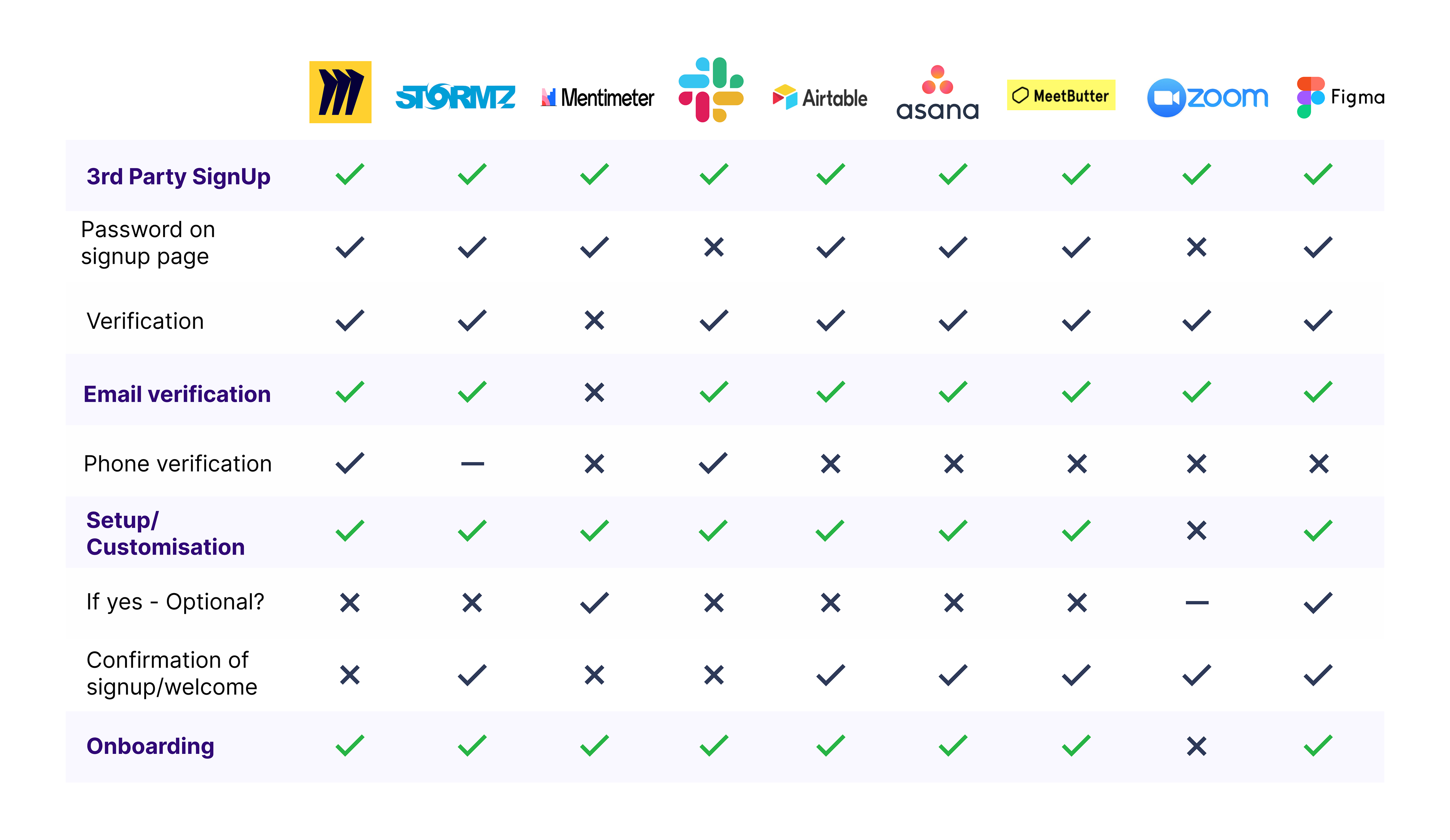
Competitor Feature Comparison
Heuristic Evaluation - measuring the usability of the existing user interfaces
I thoroughly enjoyed working with this usability inspection method. I have examined the interface and judged its compliance with recognised usability principles (Jacob Nielsen’s 10 general principles for interaction design). I have identified 15 issues and rated them based on the severity of the problem and the ease of fixing them.

Heuristic evaluation helps to identify usability problems
How users interact with the existing website and app?
We ran 5 usability test to understand how users interact with the existing platform and identify potential improvement areas. We gave them the task to explore the website, sign up, and create a workshop using a template. Meanwhile, we observed their reactions, taking notes of their actions and thoughts as well.
Our key findings were the following ones:

What are our users saying?
To begin comprehending the users, we created a survey on Google Forms and distributed the link on GA’s Slack communities and our social media platforms. We included some screening questions and asked questions mainly about their likes and dislikes regarding the workshop activities, collaboration tools they’ve used recently and their preference and frustrations for a registration process.
Our 134 survey responses allowed us to learn a lot about the users’ choices and approach towards registrations. We found that users...
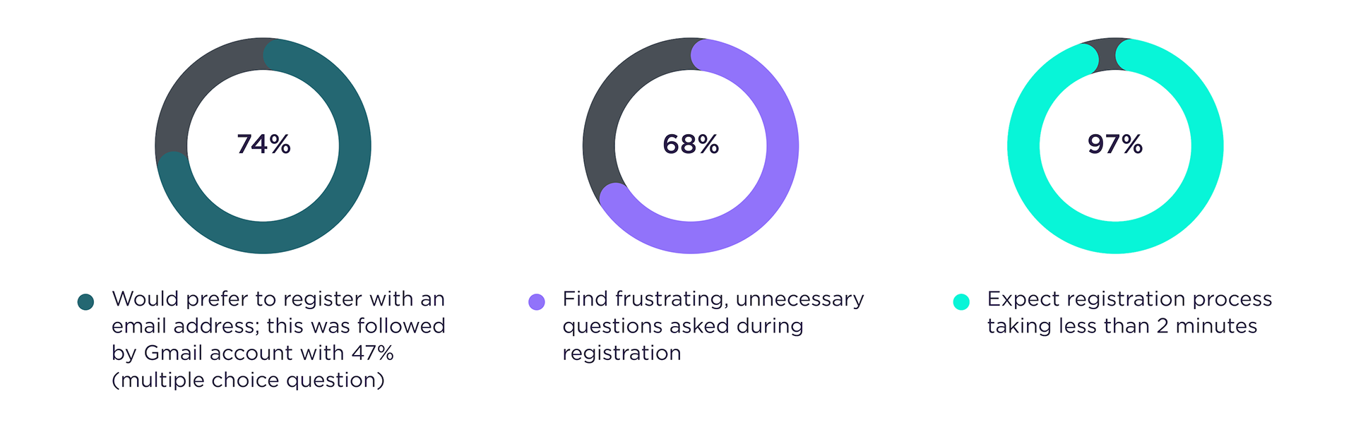
Our survey's key insights
As we needed to comprehend better our user’ needs, we contacted 9 respondents for more in-depth interviews to gain qualitative data. We have asked open-ended questions focused on their recent and past sign-up experiences and customisation expectations throughout the registration.
Affinity Mapping is a practice used to organize ideas or insights
Understanding our users
We derived the typical user persona based on our research findings. For this user persona the solution is being developed for, this conviction was super important to remain focused: “Design for everyone is designing for no one”, which remained our design mantra throughout the process. Claire helped us keep the primary user’s needs on track and at the centre of our design process.
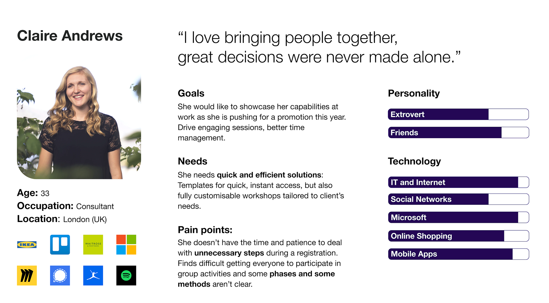
A persona is fictional character created to represent our target user type
Based on the interview insights and our persona, we have created a User Journey Map to represent the current customer experience visually.

User journey map is a visual representation of the customer experience
As a second step, we designed Claire's Empathy Map. It is a technique wherein you write what a user (in this case, our persona Claire) says, does, thinks, and feels. It helped us to externalise more knowledge of our persona and leads to a clear problem statement.
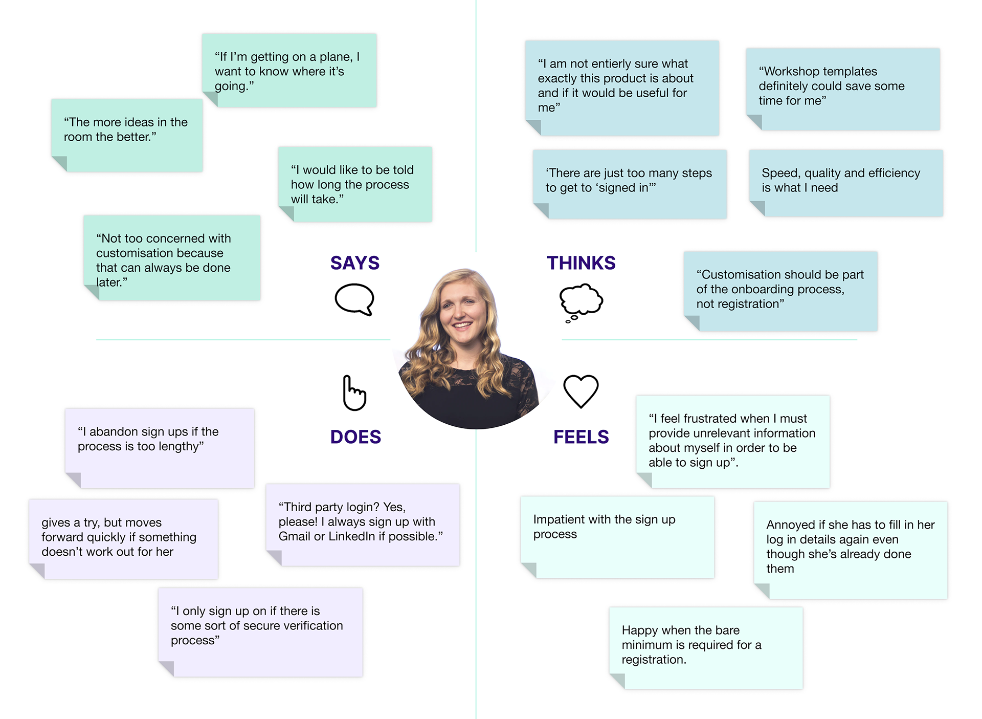
Empathy map is an easy-to-digest visual that captures knowledge about a user's behaviours and attitudes
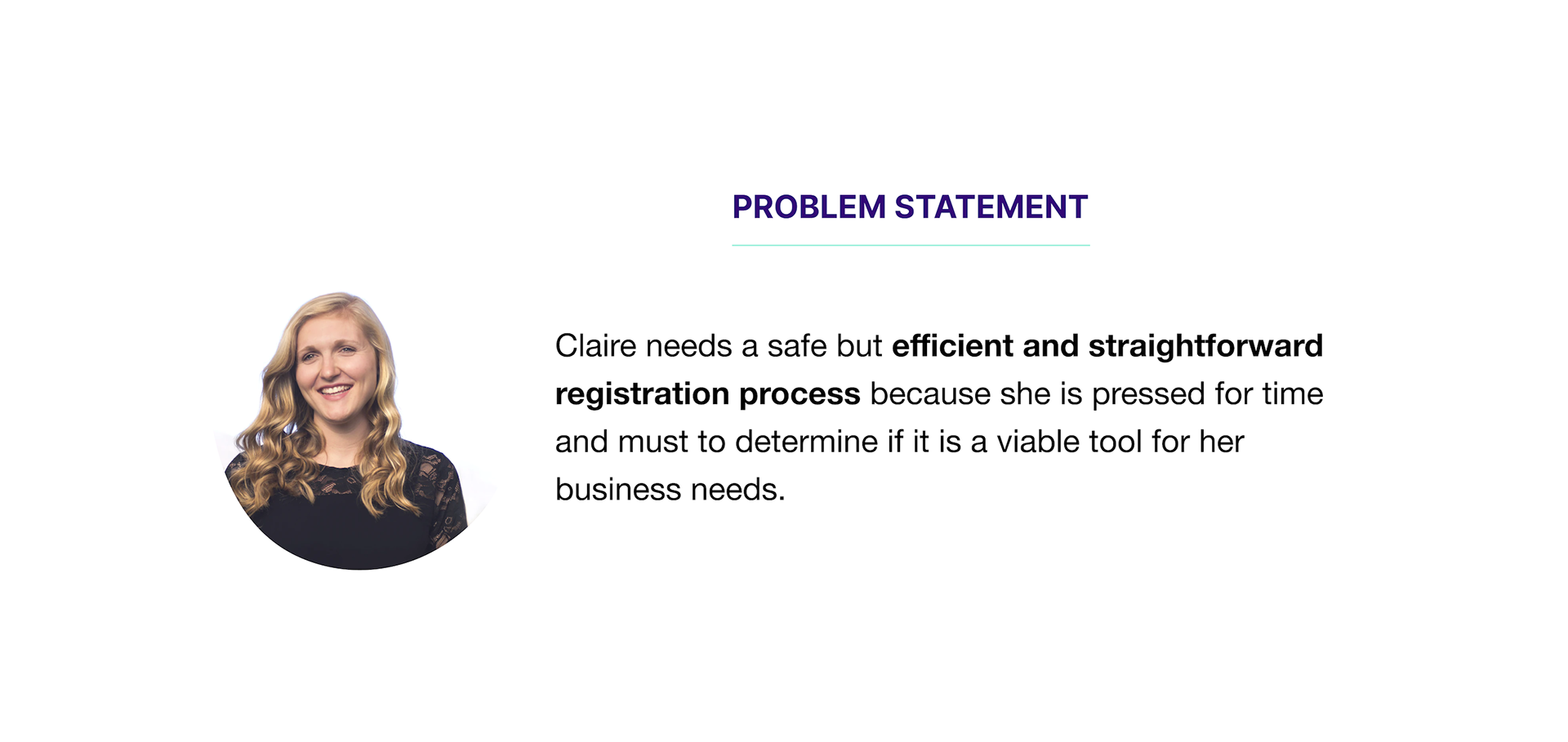
Problem statement is a clear, concise description of the issues that need to be addressed.
DESIGN
"How might we?", design studio and dot voting
Being aware of Claire’s main pain points, we decided to target them with a design thinking activity called How Might We (HMW). It is a great way to turn the problem statement’s challenge into an opportunity for designing solutions. During this meeting, we orchestrated a virtual design studio with 4 key client stakeholders (product manager, junior product manager, developer, graphic designer) and methodically brainstormed ideas centred on one key question:
“ How might we speed up the registration process?”
We generated multiple ideas and conducted dot voting to identify the most valuable ideas to implement within the design. There were lots of ideas to contend with, including passwordless login, more autonomy and choices throughout the process, a progress bar, gamification, to name a few. Due to the constraints and the users’ feedback, not all of these made it to the final design.

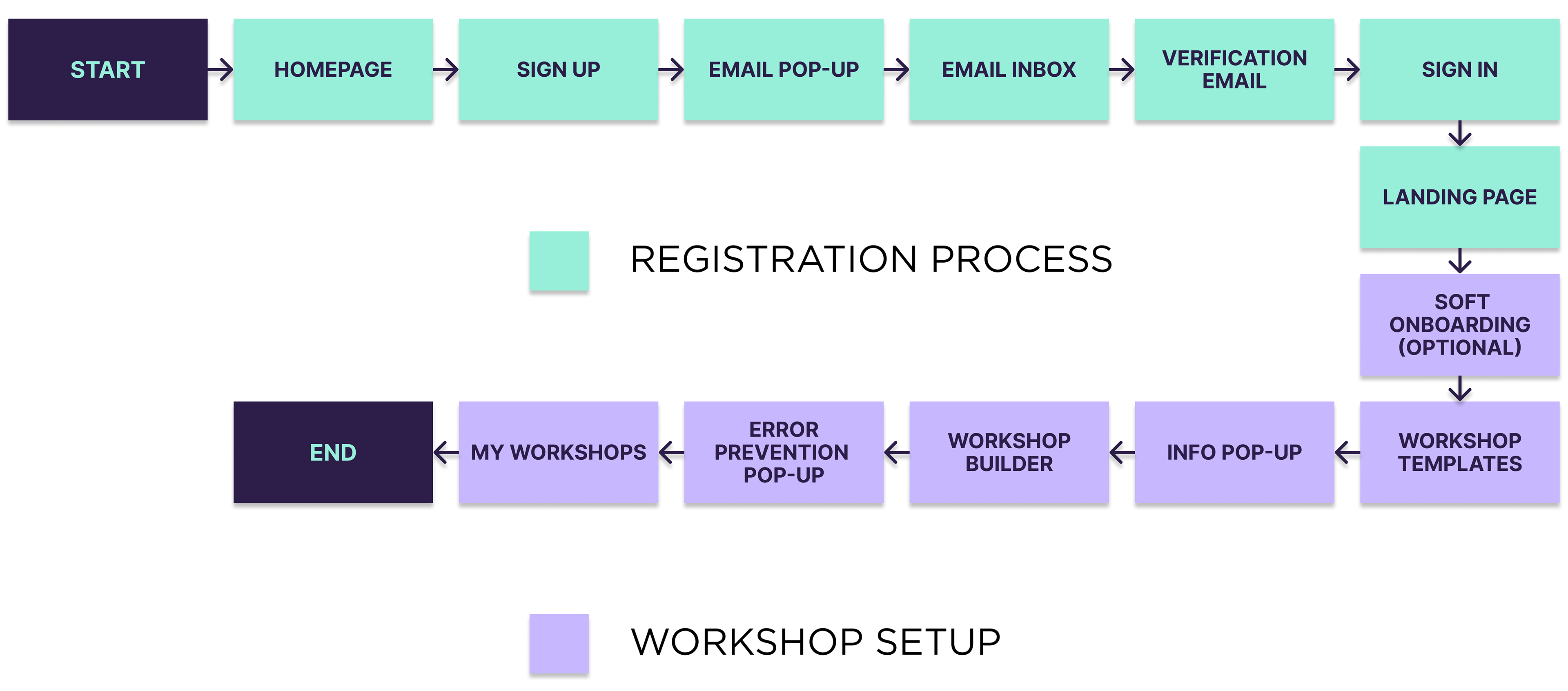
User flow
To start creating the wireframes, we solidified the user flow for our persona, Claire, walking through how she would navigate around the first time using the Axis workshops app, including signing up and setting up a workshop from a template. Based on our usability tests, user interview insights and user journey map findings, we identified four steps that potentially contribute to the high drop off rate. Therefore these screens have been removed, transferred or merged with other sections.
Initial Sketches and Digital Wireframes
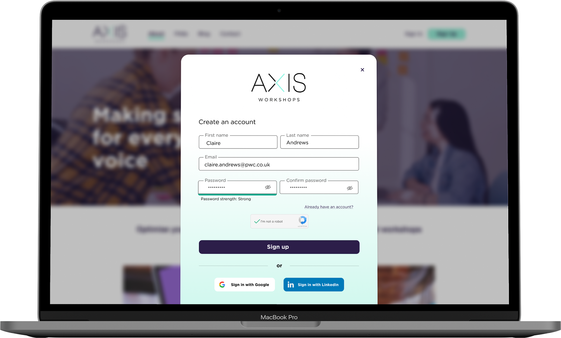
To test our screens, we built a clickable prototype (with increasing detail of the fidelity) to conduct usability testing. We wanted to know what was working and what wasn’t. The screenshots below show the existing website/app and highlight some of the changes we implemented based on user feedback. Throughout the whole iteration process, we have carried out 30 user tests in total.
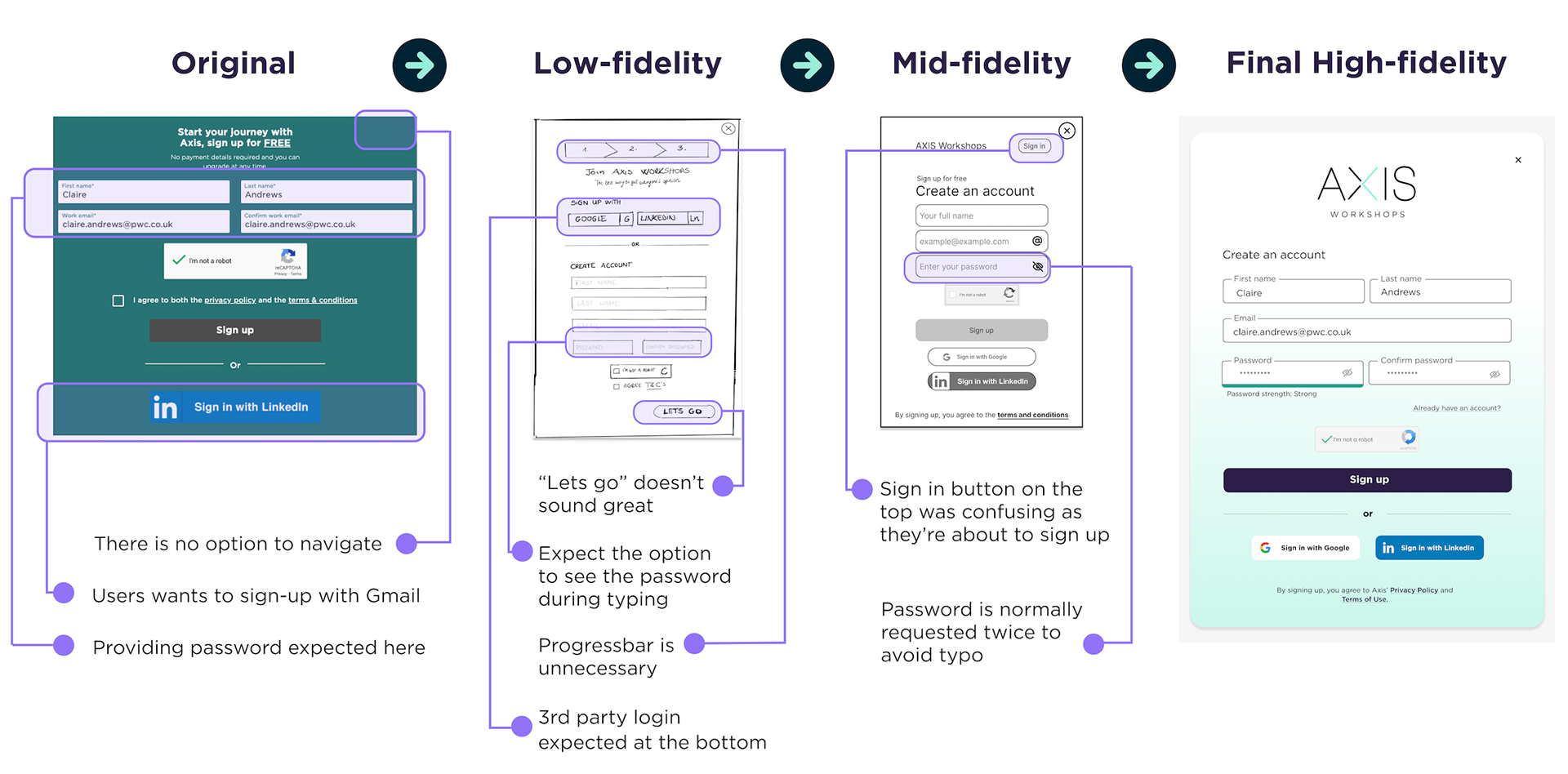
Iteration of the sign up pop-up
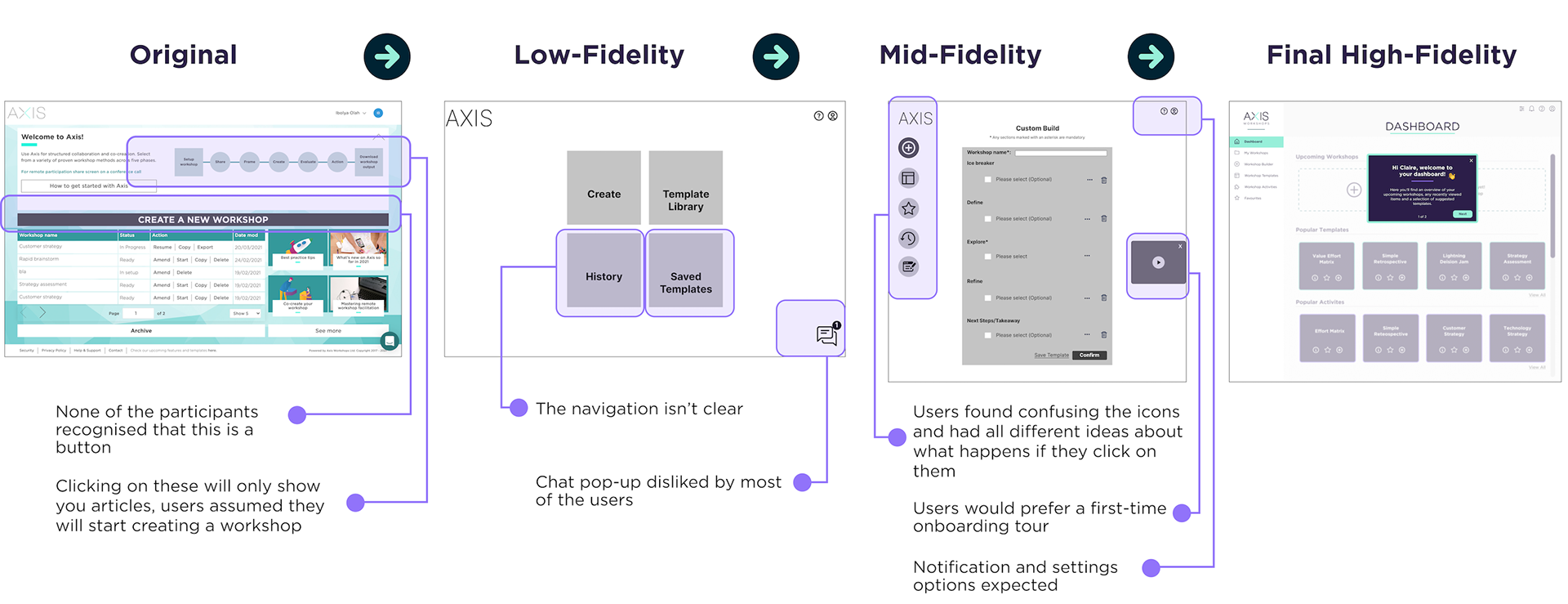
Iteration of the dashboard
The visual identity
In the low and mid-fidelity versions of the prototype, we were focused on the content usability aspect. Once we finalised 90% of the layout and content - post multiple iterations - we created a style guide to add visual design elements to the prototype to bring it to life. Our choice colours and typeface (Gotham) were based on our client's recommendation that they have already had in mind, and we found them very much in line with their brand identity.
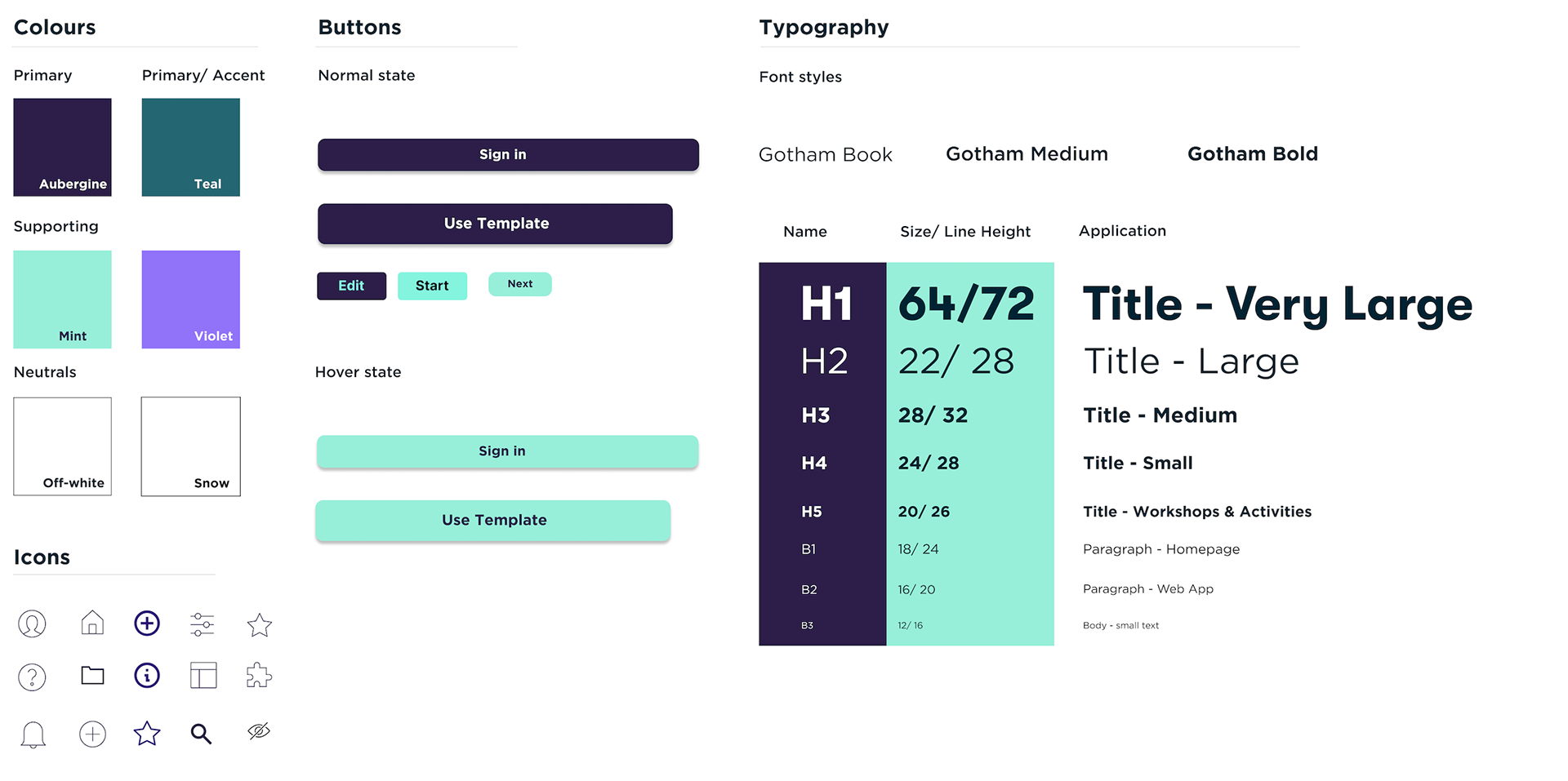
Style guide, govern the composition, design, and general look-and-feel of a company's branding
Final Design Walk-through
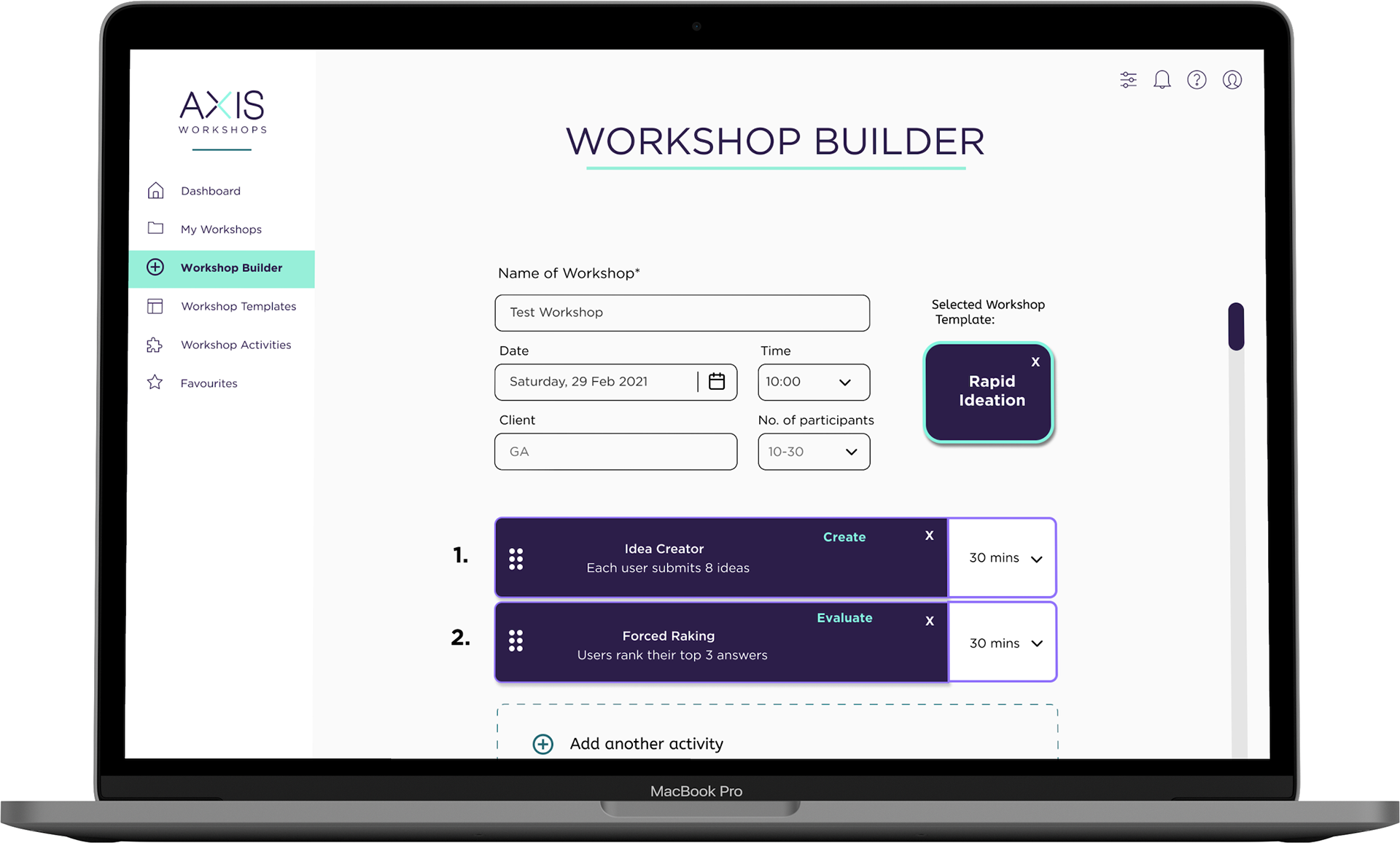
Before you go ahead and watch the video, let me remind you of Claire’s scenario (the situation in which she would use the website for a specific purpose):
She would like to sign-up on Axis Workshops, and after she logged in, she wants to create a workshop from a template. She goes to workshop templates and uses the filter to select ‘create’ and ‘evaluate’ stages. Claire is checking out the information on the Rapid Ideation template and then selects it. Finally, she adds after filling in the specific details and clicks on ‘add to my workshops’.
EVALUATION
Conclusions and next steps
As this was a three-week sprint, we were able to develop some high impact features, which hopefully will be implemented. However, a lot of work was “left behind”. It was a great challenge to work on this design, and we learnt a lot from our failures along the way. Based on our research, we have listed the following key ideas that would need further development as a possible product roadmap:
- Contextual inquiry, Testing and iterating further
- Explore and design for other possible user flows
- Developing new features
- Design for different viewports (mobile and tablet)
My key takeaways
Things won’t always go in the direction we are hoping for: I have to admit that adapting quickly to the scope's change was not an “easy ride”, but what matters is that our team overcame the challenges, and we pushed ourselves out of our comfort zone.
Usability tests on the existing product are essential: Asking the users right at the beginning can provide you with precious insights that will make your ideation process easier.
The third takeaway I would like to highlight is the 360 Degree Feedback I have received from my team members. I greatly appreciate their suggestions for improvement, and I will do my best to grow.
Check out more projects